
The Rotation Within Gold: Why the Biggest Move in This Bull Market Hasn't Started Yet
Inside the four-stage repricing cascade that every gold bull market follows — and the one metric that tells you when the final stage begins

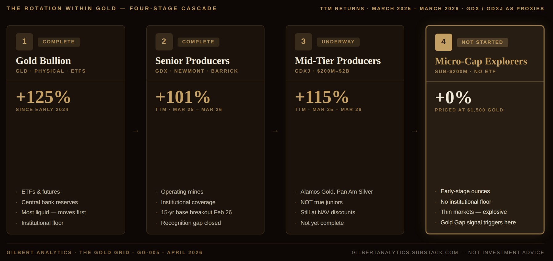
Gold has more than doubled since early 2024. Senior miners have returned 101%. Mid-tier producers, over 115%.
But below $200 million market cap — where the real ounces sit — almost nothing has moved.
That’s not a delay. It’s a pattern. Every gold bull market in modern history has repriced in the same sequence: bullion first, seniors second, mid-tiers third, micro-cap explorers last. We are partway through Stage 3. Stage 4 hasn’t started.
This article explains why — and what triggers it.
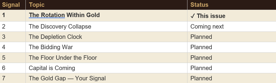
It is the first in a series called The Last Stage. Over the coming weeks, I will lay out seven pressure signals that collectively tell you Stage 4 is approaching, and the one metric — the Gold Gap itself — that tells you when it has begun.
The Cascade
Gold does not reprice all at once. It reprices in sequence — from the most liquid to the least liquid. The cascade follows the same gravitational path every cycle:
Stage 1: Gold bullion. The metal moves first. It is the most liquid, most traded, most institutional expression of the gold thesis. ETFs, futures, central bank reserves — this is where the first capital arrives. Gold went from approximately $2,000 in early 2024 to above $4,500 today — more than doubling in under two years. This is the anchor move that makes everything else possible.
Stage 2: Senior producers. The Newmonts, Barricks, and Agnico Eagles of the world. These companies have operating mines, quarterly earnings, and institutional coverage. When gold sustains a move, analysts revise earnings estimates, fund managers rotate in, and the large-cap miners follow. The GDX — the benchmark ETF for senior gold miners — broke out of a 15-year consolidation base in late February 2026, returning approximately 101% over the trailing twelve months (March 2025 to March 2026). The initial repricing is largely complete — the 15-year disconnect between senior miners and bullion has closed. If gold continues higher, seniors will follow, but they are no longer lagging. The recognition gap is gone.
Stage 3: Mid-tier producers and developers. These are the $200 million to $2 billion companies tracked by the GDXJ ETF. They have more operating leverage to gold than the majors — their cost structures are fixed, so rising gold prices flow almost directly to the bottom line. GDXJ has returned approximately 115% over the trailing twelve months (March 2025 to March 2026), surpassing even GDX on an absolute basis. This stage is underway but not complete — many mid-tiers still trade at significant discounts to net asset value.
Stage 4: Micro-cap explorers. Sub-$200 million. Often sub-$50 million. These are the companies below the GDXJ floor — the ones that hold early-stage ounces in Tier-1 jurisdictions but lack the market cap, liquidity, or institutional coverage to participate in the first three stages of the cascade. They are priced as though gold is still at $1,500. This stage has not started.
The gap between Stage 3 and Stage 4 is not an anomaly. It is the pattern. And it is the pattern because of how capital moves.
Why the Sequence Exists
The cascade exists because capital follows liquidity. The vast majority of institutional money — pension funds, sovereign wealth funds, large asset managers — is structurally excluded from micro-cap explorers. Fund mandates restrict purchases to companies above minimum market cap thresholds (often $100M or $500M). Liquidity rules require the ability to exit a full position within days — impossible when a $15 million TSX Venture stock trades $20,000-$50,000 per day. And even where rules allow it, proportionality kills the incentive: a $500,000 position in a junior explorer is 0.025% of a $2 billion fund. A triple on that stock adds 0.05% to the fund’s return. It is not worth the analyst time, the compliance paperwork, or the career risk. So institutional capital starts with bullion ETFs, then moves to large-cap miners, then to mid-caps. It does not reach micro-caps until the cycle is already well advanced.
By the time capital reaches Stage 4, it is a different kind of capital. It is specialist mining fund capital, high-net-worth retail capital, and — critically — M&A capital from senior producers who need to replace depleting reserves. This capital is smaller in aggregate, but it arrives in a market that is orders of magnitude thinner. When $50 million of institutional money flows into GDX, it barely moves the needle on a $19 billion AUM ETF. When $50 million of acquisition capital flows into a $30 million junior explorer, it reprices the entire company overnight.
This is why Stage 4 is always the most explosive. Not because the companies are better, but because the denominator is smaller.
How to See the Cascade Yourself
You don’t need proprietary data to track this. Here are three things you can check right now, for free:
Check 1: The GDX/GLD ratio. Pull up a chart of GDX divided by GLD on any charting platform (TradingView, StockCharts, Yahoo Finance). This ratio tells you whether gold mining stocks are outperforming or underperforming the metal itself. When it’s rising, miners are outperforming bullion — that means capital is flowing from Stage 1 into Stages 2 and 3. The ratio broke its 15-year downtrend in late February 2026. That breakout is the confirmation that the cascade is active.
Check 2: GDXJ’s actual holdings. Go to VanEck’s website and look at GDXJ’s top holdings. You will find Alamos Gold, Coeur Mining, and other companies with multi-billion dollar market caps. These are mid-tier producers, not junior explorers. When someone tells you “junior miners have rallied 115%,” they’re talking about these companies — not the sub-$200M explorers that haven’t moved. Understanding this distinction is critical.
Check 3: The Gold Gap chart. This is where you track Stage 4 directly. The chart shows two things: what the operating margin says acquirers should be paying for an ounce of gold in the ground (the benchmark, currently $729/oz), and what they actually pay (the M&A data, currently clustered around $93/oz). When the actual prices start climbing — when you see new data points appearing above the historical cluster — the Gold Gap is closing. That’s the signal.
See the interactive Gold Gap chart: gilbertanalytics.github.io/gold-gap
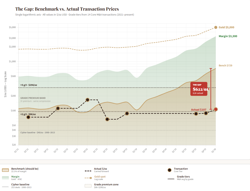
As of today, the chart shows no movement. The M&A cluster sits where it has been for over a decade. That’s the point — Stage 4 hasn’t started yet. But the pressure building behind it is unprecedented.
The Historical Precedent
This is not a theoretical framework. It is an observable pattern that has repeated in every significant gold bull market.
The 1970s. Gold went from $35 to $850 between 1971 and 1980. The bullion move came first. Senior producers followed with a lag. Junior explorers — particularly in the Canadian and Australian markets — experienced their most explosive repricing in the final 18-24 months of the cycle, after the institutional money had rotated through the large and mid-caps.
The early 2000s. Gold bottomed at $252 in 1999 and climbed to $1,921 by 2011. The GDX ETF (launched in 2006) outperformed bullion from 2008-2011. But the truly explosive returns were in the micro-cap explorers and developers from 2009-2011, after the global financial crisis had forced senior producers to replenish depleted pipelines through acquisition. The TSX Venture Composite Index — a rough proxy for junior mining — more than tripled from its 2008 low to its 2011 high.
In both cycles, the same pattern held: bullion led, seniors followed, mid-tiers confirmed, and micro-caps exploded last. We are in that sequence right now.
The GDXJ Problem
There is an important distinction that most market commentary misses. The VanEck Junior Gold Miners ETF (GDXJ) is not a junior mining ETF. Not anymore.
GDXJ targets companies with market capitalizations between $200 million and $2 billion. Its largest holdings include Alamos Gold, Coeur Mining, and other companies with multi-billion dollar market caps and operating mines producing hundreds of thousands of ounces per year. These are mid-tier producers, not junior explorers.
The true junior explorers — the sub-$200 million companies with early-stage resources, pre-43-101 deposits, and active drill programs — have no ETF. They have no institutional benchmark. They are invisible to the passive investment flows that have driven Stages 1 through 3.
This is not a flaw. It is the mechanism. The absence of passive indexation is what keeps Stage 4 companies underpriced until active capital — specialist funds and corporate acquirers — arrives.
When you hear that “junior gold miners have rallied 115%,” now you know what to ask: which juniors? The $2 billion mid-tiers in GDXJ? Or the $30 million explorers sitting on real ounces?
Where We Are Now
The evidence for Stage 3 confirmation is substantial:
The GDX-to-GLD ratio broke out of a 15-year base in February 2026. This is a structural shift, not a cyclical bounce. Metals and mining M&A reached $89 billion across 180 transactions in 2025 — the strongest year since the 2010-2012 super-cycle — with gold dominating deal activity for the second consecutive year. Precious metal miners alone raised $14.5 billion in capital, more than triple the $4.6 billion raised in 2024. Capital is flooding into the sector at a pace not seen in over a decade.
Senior and mid-tier producers are generating record free cash flow. With all-in sustaining costs averaging approximately $1,700/oz and gold above $4,500, margins are in excess of $2,800 per ounce. These margins are being reinvested into exploration, development, and — increasingly — acquisition.
Stage 3 is confirming. The rotation is moving down-cap. The question is what triggers Stage 4.
What Triggers Stage 4
Stage 4 does not begin because retail investors discover micro-cap gold stocks. It begins because of three forces that are already in motion:
Force 1: Reserve depletion forces M&A down-cap. Senior producers are depleting their reserves faster than they can replace them. In the most recent comprehensive industry study (McKinsey, covering 2012-2017), combined reserves of the top 20 gold companies declined 26% — from 967 million ounces to 713 million ounces. Average mine life shortened from 19 to 16.5 years. That trend has almost certainly continued, given what has happened since: zero major gold discoveries (deposits of 2+ million ounces) in 2023 and 2024 — the first time in recorded history. Majors cannot drill their way out. S&P Global estimates the average timeline from discovery to production at approximately 16 years, and many complex projects take 20 or more. Even a discovery made today would not produce gold until the late 2030s at the earliest. Acquisition is not optional — it is existential. And as the mid-tier targets get acquired or repriced, acquirers will be forced further down the market cap spectrum.
Force 2: Capital starvation creates the asymmetry. The irony of Stage 4 is that the companies most likely to be acquired are the ones least able to attract capital today. Exploration budgets for junior companies dropped 15% in 2023 and another 7% in 2024. Grassroots exploration — the only way to find new deposits — has collapsed from 50% of total budgets in the 1990s to just 19% in 2024. The result is a dwindling population of funded, active explorers sitting on real ounces. When capital finally rotates to this tier, it will find a very thin market.
Force 3: The Gold Gap compression becomes unsustainable. This is the quantitative bridge between the macro and the micro. Across 11 core M&A transactions involving pre-production gold assets in Tier-1 jurisdictions since 2021, the median price paid per ounce of gold in the ground is US$93 (the Core Median from the Gilbert Analytics M&A database). The benchmark — 22.1% of current operating margin ($5,000 minus $1,700 AISC = $3,300 × 0.221) — implies a margin-justified value of $729/oz. That is 87.2% compression.
The compression was explainable when gold was at $1,500-2,000. Acquirers were being prudent. Deposit quality was mixed. Risk premiums were high. But at today’s gold price, with $2,800+ margins, the gap between what an ounce of gold is worth in a producing mine and what the market charges for it in the ground has become historically anomalous. At some point, a senior producer looking at a 16-year mine life, zero new discoveries, and record margins does the math and realizes that paying $150 or $200 or $300 per ounce for a quality deposit in Nevada or Ontario is still a bargain.
When that math starts showing up in actual deal premiums — when the M&A data begins tracking above the $93 Core Median — the Gold Gap is closing. That is the signal that Stage 4 has begun. You can track it yourself on the interactive Gold Gap chart.
The Grid — our 100-point scoring system for junior gold explorers — has already identified companies positioned at the intersection of these three forces: quality ounces, Tier-1 jurisdictions, and deep Gold Gap discounts. One Active Coverage company currently trades at an EV/oz of under $40 against that $729 benchmark. Their names, scores, and Gold Gap positioning will be available to paid subscribers when the founding member tier launches this summer.
What to Watch — The 7 Signals
This article is the framework. The next six pieces in this series will each introduce one pressure signal — and show you how to check it yourself:
Signal 2: The Discovery Collapse. S&P Global’s data on the structural decline in gold discoveries and what it means for the scarcity premium on existing ounces.
Signal 3: The Depletion Clock. Company-level reserve replacement data showing which major producers are running out of time.
Signal 4: The Bidding War. Updated M&A data showing deal frequency, premiums, and the down-cap migration of acquisition targets.
Signal 5: The Floor Under the Floor. How central bank buying at 1,000+ tonnes per year creates a structural price floor that makes the Gold Gap compression permanent, not cyclical.
Signal 6: Capital is Coming. The capital starvation paradox — money is flooding into gold equities, but it hasn’t reached the sub-$200M tier yet. When it does, the denominators are tiny.
Signal 7: The Gold Gap — Your Signal. The Gold Gap as the single metric that tells you Stage 4 has started, and how to read it in real time.
Each signal adds pressure. The Gold Gap is the scoreboard.
The Punchline
Everyone sees the gold bull market. Almost nobody sees the stage that hasn’t started yet.
The rotation within gold follows the same path it has followed in every prior cycle: bullion first, seniors second, mid-tiers third, micro-cap explorers last. We are partway through Stage 3. The forces that trigger Stage 4 — reserve depletion, the discovery collapse, capital starvation, and Gold Gap compression — are already in motion.
The question is not if Stage 4 arrives. It is when. And the Gold Gap is how you’ll know.
What stage are you watching?
SIGNAL TRACKER — THE LAST STAGE
The Gold Grid is published by Gilbert Analytics. The analysis in this article reflects the author’s research and interpretation of publicly available data. It is not a buy, sell, or hold recommendation for any security. The Gold Gap Index is a macro market indicator, not a property-level valuation tool — it identifies the tide; individual analysis identifies the boats. The author holds positions in publicly traded junior gold companies. Specific holdings are disclosed to paid subscribers. Always consult a qualified professional before making investment decisions.
Gilbert Analytics | The Gold Grid | #gold #mining #GoldGap #juniormining #exploration #GoldGrid
There's tons of junk miners out there too....how to filter out the good ones?